Why Are High-Converting Web Forms Important?
Before diving into the step-by-step process, let's quickly review why web form optimization matters. According to a study by HubSpot, 38% of marketers reported that their web forms are their highest converting lead generation tool. Web forms are often the first point of direct interaction between you and a potential customer, and if done right, they can significantly impact your bottom line.
But creating a web form that converts isn't as simple as slapping a few fields onto a webpage. The structure, design, placement, and even the wording of your form can have a huge effect on whether a visitor chooses to fill it out or clicks away.
Step-by-Step Guide to Creating High-Converting Web Forms with KNVEY
Here’s a step-by-step guide on how you can create high-converting web forms using KNVEY, focusing on actionable tips to improve form design, placement, and more.
Step 1: Define Your Goal
The first step in creating a high-converting web form is to define its purpose. Ask yourself, "What do I want to achieve with this form?" Common goals include:
- Capturing leads
- Gathering customer feedback
- Processing inquiries
- Setting up product demo requests
- Allowing event registrations
Once your goal is clear, it will be easier to decide what fields should be included and how to structure the form. A clear and focused objective will guide the form creation process, helping you avoid the common pitfall of asking for too much information, which can scare users away.
Actionable Tip: For lead generation forms, aim to collect just enough information to initiate contact (e.g., name, email, and phone number), and save more detailed questions for later in the customer journey.
Step 2: Choose the Right Form Type
KNVEY allows you to create several different types of forms, from simple one-step forms to multi-step forms that guide users through a process. Depending on your objective, you can choose the type of form that best suits your needs:
- Single-step forms: Ideal for simple actions like newsletter sign-ups or contact forms.
- Multi-step forms: Perfect for more complex processes like event registrations, surveys, or quote requests. Breaking down the form into multiple steps makes the process feel more manageable for users, improving completion rates.
Actionable Tip: If your form requires more than five fields, consider using a multi-step form. Research from Formstack suggests that multi-step forms can increase conversions by up to 214% compared to long single-step forms.
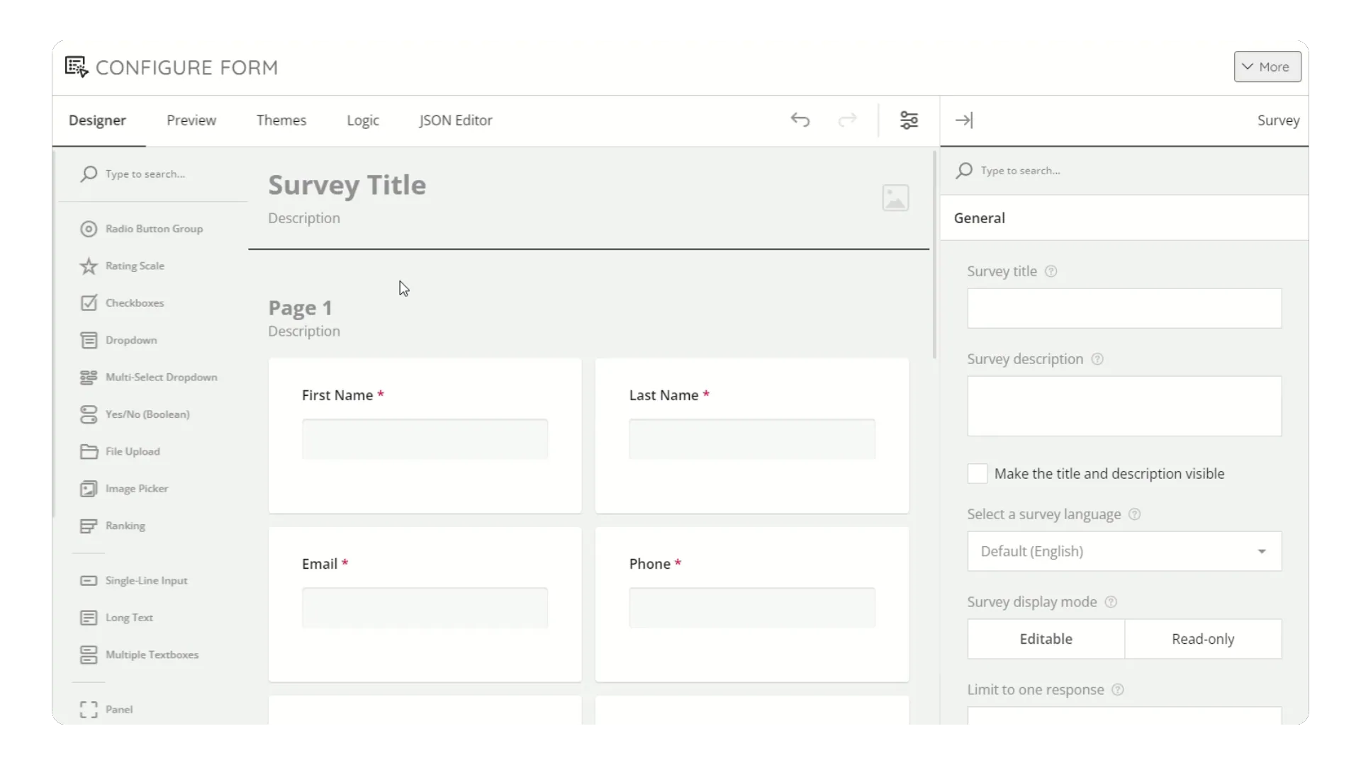
Step 3: Simplify the Form Design
When it comes to web forms, simplicity is key. Users are more likely to fill out a form that looks clean, straightforward, and easy to complete. With KNVEY’s drag-and-drop form builder, you can easily create forms that look polished and professional without needing any coding knowledge.
Here’s how you can simplify your form design:
- Limit the number of fields: Only ask for essential information. Each additional field decreases the likelihood of completion.
- Use clear labels: Make sure each field is labeled clearly and concisely. For example, instead of "Your Full Name," simply use "Name."
- Minimize required fields: Only mark fields as required if absolutely necessary. Too many required fields can frustrate users and lead to form abandonment.
- Utilize white space: Break up your form with white space to avoid overwhelming visitors with a wall of text or input fields.
Actionable Tip: For best results, use a single-column layout. Research shows that single-column forms are faster to complete and reduce confusion compared to multi-column layouts.
Step 4: Add Strong Calls-to-Action (CTAs)
A high-converting web form needs a strong call-to-action (CTA). The CTA button is where visitors will either complete the form or abandon it, so it’s important to make this element stand out and compel users to take action.
Best practices for CTAs include:
- Use action-oriented text: Instead of using a generic "Submit" button, use specific, action-driven text that reflects the value the user is getting, such as "Get Your Free Guide," "Request a Demo," or "Download Now."
- Make the button stand out: Ensure that the CTA button is easily visible by using a contrasting color and positioning it where users can see it without scrolling.
- Create urgency: If applicable, add a sense of urgency with words like "Limited Time Offer" or "Get Started Today."
Actionable Tip: Studies show that using first-person phrasing in CTA buttons (e.g., "Start My Free Trial") can improve click-through rates by 90% compared to third-person phrasing (e.g., "Start Your Free Trial").
Step 5: Optimize Form Placement
Where you place your web form on the page can significantly impact its conversion rate. Forms should be easy to find, and visitors should encounter them at the right moment in their journey.
Here are a few key placement strategies:
- Above the fold: Place the form high enough on the page that users don’t have to scroll to find it. This is especially important for high-intent pages like landing pages or product pages.
- After valuable content: If your form is embedded in a blog post or a resource page, placing it after or alongside valuable content ensures that users have context before filling it out.
- Pop-ups and slide-ins: KNVEY allows you to create pop-up or slide-in forms that appear at specific points, such as when a user has been on the page for a certain amount of time or is about to leave (exit intent). These strategically timed forms can capture attention at the right moment.
Actionable Tip: Try using an exit-intent pop-up for users who are about to leave your site. By offering an incentive like a discount or free resource, you can capture leads that would have otherwise bounced.
Step 6: Offer an Incentive
One of the most effective ways to encourage visitors to fill out your form is by offering an incentive. People are more likely to provide their contact details when they get something in return, such as a free e-book, discount code, or exclusive access to content.
The incentive should be relevant to your audience and aligned with the form’s goal. For instance:
- For lead generation, offer a free downloadable resource or a discount code.
- For demo requests, emphasize the value of personalized consultation or product insights.
- For event registrations, offer early-bird pricing or exclusive attendee perks.
Actionable Tip: Ensure the value of the incentive is clear in the form’s headline and CTA. For example, instead of "Sign Up for Our Newsletter," try "Get 20% Off Your First Purchase by Signing Up for Our Newsletter."
Step 7: Ensure Mobile Responsiveness
With more than 50% of web traffic coming from mobile devices, it’s critical to ensure that your forms are mobile-friendly. KNVEY’s web forms are automatically optimized for mobile devices, providing a smooth and responsive experience no matter the device.
When testing your form, make sure that:
- The form fields are large enough to tap easily on mobile screens.
- The text is legible without the need for zooming.
- Buttons are large and easy to tap.
- The layout adjusts to fit smaller screens without cutting off important elements.
Actionable Tip: Make sure that fields for phone numbers, email addresses, and dates use appropriate mobile-friendly input types (e.g., numeric keypads for phone fields). This small adjustment can significantly improve the mobile user experience.
Step 8: Test, Analyze, and Optimize
Once your form is live, the work doesn’t stop. To ensure your form is performing at its best, it’s important to continuously test and optimize it. KNVEY allows you to track form submissions and analyze conversion data so you can identify opportunities for improvement.
Here are a few metrics to track:
- Conversion rate: The percentage of users who complete the form after viewing it.
- Abandonment rate: The percentage of users who start filling out the form but don’t complete it.
- Field completion rate: Which fields are causing users to abandon the form? Removing unnecessary or complex fields can boost conversion rates.
Actionable Tip: Use A/B testing to experiment with different form designs, field arrangements, CTAs, and placements. Small tweaks, such as changing the color of your CTA button or reducing the number of fields, can have a significant impact on your conversion rate.